BouncePilot Resources

21 Tips Guaranteed To Increase Your Purchase Conversion Rates

It’s a never ending battle. Customer purchase patterns change, and eCommerce managers and digital marketers fight to understand anticipate them. How can you tell when you’re winning?

It’s a never ending battle. Customer purchase patterns change, and eCommerce managers and digital marketers fight to understand anticipate them. How can you tell when you’re winning?

If this were Monday Night Football, we’d measure the war in metrics like completion percentage (your purchase conversion rate) and turnovers (your abandonment funnel – ranging from shopping cart abandonment at the bottom, up through product view abandonment, to category abandonment, and finally generic website abandonment at the top). What’s this war worth?

If A Majority Of ECommerce Businesses Were Able To Increase Their Conversion Rates By 35% They Would Recover Over $260 Billion In Abandoned Revenue.

35% is an average increase through using optimization strategies. Whether you’re getting 100,000 visitors to your store per month or 50 million, your online store is missing out on opportunities. And the more traffic you get, the more you stand to gain by improving cart and purchase conversion rates using the tips below.

Note: As customer behavior changes, CRO strategies and technologies also change – using them before it becomes commonplace, helps brands to stand out from the crowd. #5 is the newest strategy for eCommerce businesses in 2018. Click here if you’re short on time and want one actionable strategy to implement now.

In This Article:

  • What you won’t find: Anything regarding the testing of button colors. You’ll hear a lot of BS about using blue or orange buttons being the top things to test. But seriously.  It doesn’t matter if your buttons are teal, purple, pink, black, or rainbow. All that matters is that they stand out from the rest of your site, are noticeable, and have clear language to convert users.
  • What you’ll find: 21 real strategies and tips to increase purchase conversion rates backed by data, real test cases, and experiences.

01

Mobile First

Approximately 24% of all digital purchases are made via mobile with 80% of shoppers having used mobile to view product reviews, shop, compare prices, or find alternative store options.

Most eCommerce store platforms provide an out-of-the-box mobile experience, but you should never stop trying to optimize your site for the mobile experience.

02

Give Visitors The Option Of Creating An Account After Purchasing Not During.

One of the most common things you’ll find during a checkout experience is forcing shoppers to register and create accounts prior to purchasing, or enabling previous shoppers to login. This makes the whole shopping experience easier right? After all, if previous customers want to checkout faster, the logging in will automatically remember their shipping and personal information right? And it’s not really that much extra work for a new customer to fill out that information… is it?

Well, one major retailer found that by removing the “Register” button prior to checkout resulted in a purchase conversion rate increase of 45%, or $300 million/year.

The biggest issues with the “Registration” were this:

  1. First-time purchasers simply want to buy something and are not looking to build a relationship with your brand right away.
  2. Approx. 45% of customers had multiple registrations. How is this possible you might ask? Well, think about the experience. Some customers will use an email and password, forget the password, then create an entirely new account with a new email address. Some may register with a specific email address one time, then login using facebook the next time. It’s possible that customers can end up with upwards of 10 accounts linked to a single customer!

03

Let Buyers Save Cart Or Add To A Wishlist For Later… Without Leaving Their Email Address

89% of customers abandon their cart at least once. Afterwards, you spend hundreds of thousands of ad dollars retargeting these folks back to your site, and then force them to locate all of the items from their cart all over again. Remove that hurdle.

Several studies cover retargeting ads, but this one, in particular, speaks to the benefits of the “Save to Cart” functionality. Using a retargeted ad with items that were “Saved to a Cart” yielded a 70% lift in purchase conversion rates.

04

Use Abandoned Cart Emails

What do you think is the highest converting tool in your marketing arsenal? Is it your PPC ads? One-off marketing campaigns? Maybe your retargeting? Wrong. It’s most likely your abandoned cart emails. On average, 44.1% of abandoned cart emails are opened, 11.6% of emails lead to a click back to site, and almost 30% of those clicks convert to a recovered purchase. And these numbers can even increase up to 80% open rate and 30% clickthrough back to site!

So are you making the most of your abandoned cart emails? Probably not. Here are some best practices for creating abandoned cart emails.

    1. Timing is key. Make sure to send your first email within 1 hour of abandonment.
    2. Clear subject line. There are several strategies for creating the best subject line for abandoned cart emails. We recommend testing each to see which drives the best results. For reference, you can try the clear obvious route (you left some items in your cart), using a more personal touch (Hey Joe, you forgot about these items), creating a sense of urgency (Hurry up Joe! Your cart will expire in 24 hours!), getting quirky (Let us teleport you back to your shopping cart), appeal to their sense of excitement (Hey Joe, you forgot how much you wanted this!).
    3. Remind them what they left behind. Be as specific as possible, use product photos, price, size, color, etc.
    4. Create awesome copy. The copy should remind them that they left something in their cart, they liked the item enough to place it in their cart, they should come back to the site to purchase, and their cart will expire soon.
    5. Call to Action. Have a super focused CTA that drives them back to site like “Continue Shopping” or “Complete My Order.”
    6. Use temptation. Tempt them back with other similar items or promo codes to complete their order. You’d be surprised how effective these are in driving shoppers back.

  1. Use social proof. Testimonials, reviews, videos, tweets. Use these different tools as a way to show customers they’re missing out.

05

NoCRM Email Retargeting

Starting in 2018, you’ll be able to extend your abandonment emails to EVERY VISITOR on your site, whether you have their email address OR NOT. This is an eCommerce game changer. You might be asking yourself – how is this possible? The answer: noCRM email retargeting.

Note: This IS NOT the same as taking a list of email addresses and throwing them into a retargeting campaign.

Use Case: Today you use triggered abandoned cart emails when you can identify a logged-in visitor. It’s your #1 conversion tool. Only 5% of your visitors shop logged-in. What happens to the other 95%? Now imagine, if you had an email address for every one of those people, and automated abandoned cart/website campaigns running. Is the hamster wheel in your head turning yet? Because it should be.

With 44%+ open rates from abandoned cart emails and higher conversion rates than the majority of your marketing campaigns, noCRM Email Retargeting is set to be the biggest game-changer for ecommerce businesses. If you receive 10% of your revenue from your abandoned cart campaigns, and you’re only targeting 5% of your audience – then if you can target an additional 5%, that’s another 10% more revenue.  Companies like BouncePilot can identify 15%-50% of your website visitors and email them on your behalf. The math isn’t difficult on this one.

06

Ad Retargeting

If you’re spending on PPC ads but not retargeting, then you’re not running efficiently. All of the money spent driving visitors to your site is just wasted when they do not purchase. That’s why it’s so important to leverage retargeting ads. Retargeting ads allow you to keep pushing ads to site visitors even if they never made a purchase or subscribed to your mailing list. But that’s not even the best part.

Retargeting ads have a 10X higher average clickthrough rate when compared to traditional display ads, they result in a 1,046% lift in branded search,  will bring back 26% of customers to complete the checkout process, and 70% of shoppers are more likely to convert from being retargeted after cart abandonment.

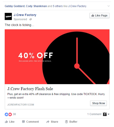
Here are some examples of different retargeting ads to get those creative juices flowing.

07

Alternative Payment Options

ore than accepting multiple forms of credit card payments (Visa, AmEx, Mastercard, etc), this goes towards having a fail-safe. What happens if you’re using Stripe to accept online credit card payments and for some reason, a percentage of payments are declined. If Stripe is your only form of accepting payment, then you’re going to lose quite a bit of revenue when payments decline. That’s why having a fail-safe such as PayPal is so valuable. If Stripe declines, then your customer has the ability to complete the purchase through Paypal.

True Story: I was shopping for some new home appliances on Sears.com. For some reason, every time I tried checking out through their credit card system it would error. Luckily for them, they managed to salvage my order by popping up an additional payment method of Paypal. I quickly filled in my Paypal info, clicked order, and voila. There are a lot of payment providers out there. I trust in your google-abilities to find the right ones for you.

08

Display A Checkout Progress Bar

Human psychology is a funny thing. Does having a progress bar on your checkout process increase conversion rates? Do people like to know how many steps are required to complete the checkout? Or is because they reeeeeallly want to get to 100%?

The answer is a little of both. LeadPages ran a series of split tests using a Progress Bar vs No progress Bar and found that the Progress Bar led to an uplift of ~28.29% in conversion rates.

They speculated that the progress bar increased conversion rates because it communicated the customer’s position within the funnel and the number of steps left. We believe that transparency plays a big part in the conversion process. Below you’ll find that a few more tips related to transparency, such as product imagery, shipping times/costs, and security all lead to higher conversion rates. The big correlation here is transparency. Customers are already taking a chance ordering products online, so creating an experience that is as transparent as possible will naturally make customers more prone to purchasing.

09

Invest In Product Images

When purchasing online, most customers like to believe that what you see is what you get. But that’s not always the case. Sometime you may see a dress that looks white and gold… but is actually black and blue.

Don’t try to DIY your product photos unless you have some photography chops. DueMaternity and GolfSmith were able to increase conversion rates by 27-40% just by increasing the quality of the images. This year, you can expect to see an increase in the use of better quality imagery for products, as well as the inclusion of real-life customer photos being used in conjunction with the product photos a-la West Elm. You’ll even start to see more use of 360 degree rotating images, and product videos. StacksandStacks.com saw a 144% increase in conversion rates by using product videos, and if you go to Asos.com, then you’ll notice all of their products now feature runway videos of models rocking those sweet pants that you were interested in buying.

10

Create Better Product Copy

How powerful are the words on your product pages? By changing the story and positioning of their product, Hubspot increased their conversion rates by over 62%.  And by simply writing incredible copy, the “Significant Objects” project was able to resell a ceramic horse head at an increase of 625%. So, how powerful are the words on your page? VERY.

Here are some quick tips for writing better product copy (we’ll go into more detail in a future post).

  1. Create Personas – Understand your buyers and who you want to sell your product to. Make sure to create copy that tells their story and how your product will benefit them specifically. There are four distinct persona types that your audience will fall into: the logical persona (these are the folks that scrutinize your product and shop around), the impulsive persona( they’re prone to make quick decisions), the caring persona (these folks care about how purchasing your product will affect others around them as well), and the aggressive persona (rational and focused on self improvement).
  2. Use Power Words – These are words that evoke emotions such as: Jaw-dropping, stupendous, smashing, crush, hero, etc.
  3. Use the Right Formatting – Follow an information hierarchy that puts the most important information in the first couple of paragraphs and the rest below. Make sure to use bullet points and short paragraphs to make it easier to scan.
  4. Emphasize Your Brand – Use your brand’s story, logo and history to relate more to the buyer. You want them to understand you and why you are selling them this product.

Here are some examples of some of our favorite product descriptions:

  1. Anorak Online
  2. ThinkGeek
  3. Fab
  4. ModCloth
  5. MyPakage
  6. Triumph and Disaster

11

Include Credit Card Logos And Security Seals.

By now you must have heard about the importance of using credit card and security seals to earn the trust of shoppers. By implementing something as simple as the Norton Security Seal, eCommerce businesses have seen increases ranging from 11-40%.

12

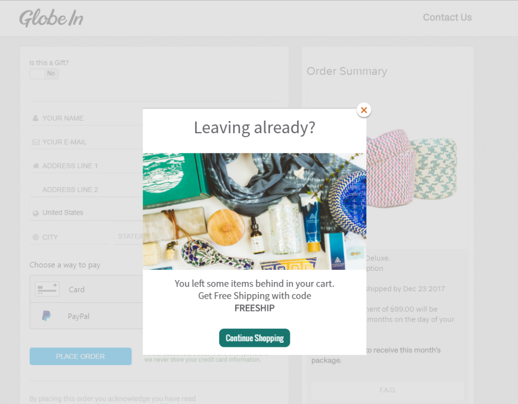
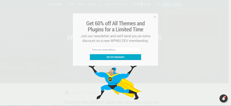
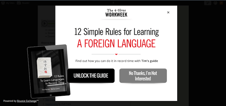
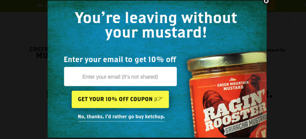
Exit Popups

I personally love exit popups. Why? It allows savvy ecommerce and digital marketers another opportunity to convert a visitor.

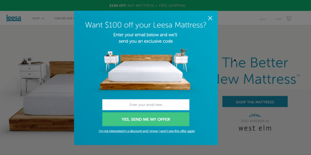
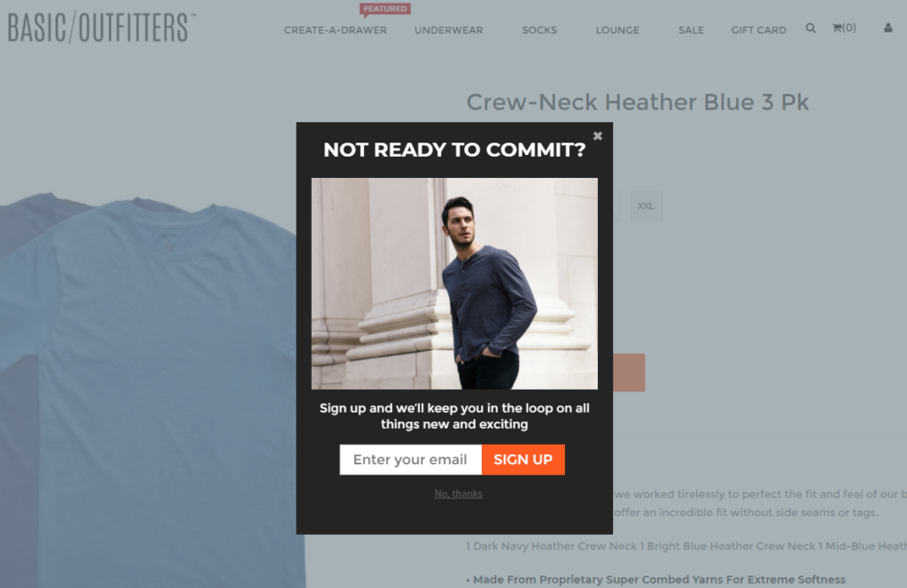
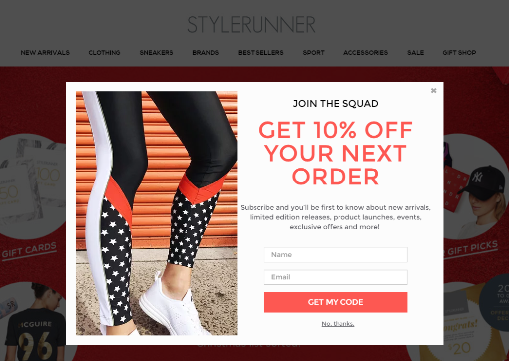
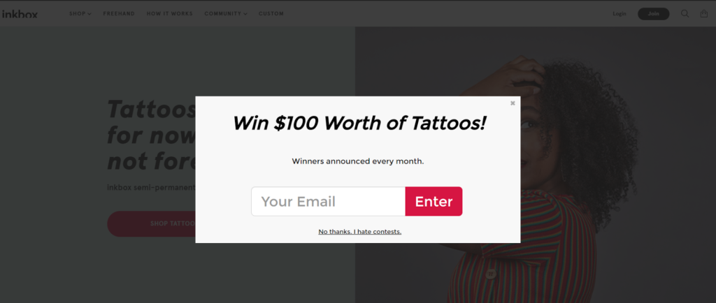
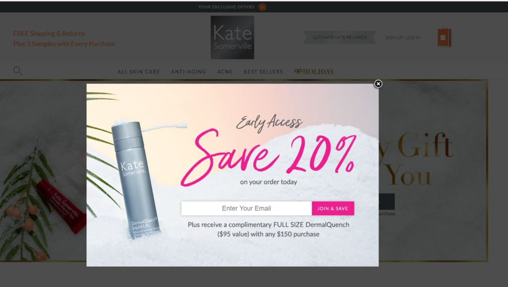
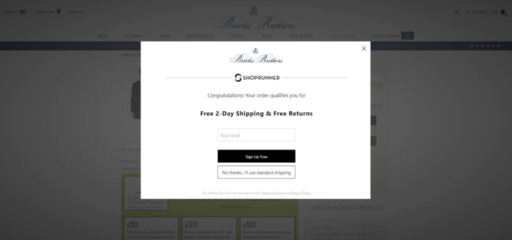
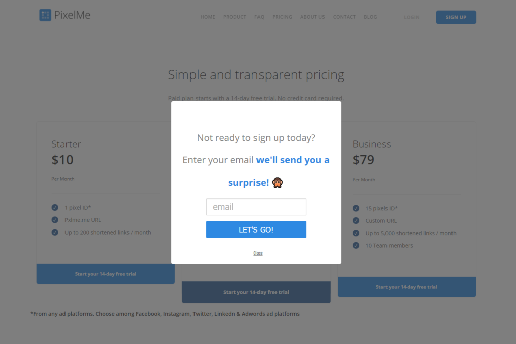
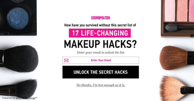
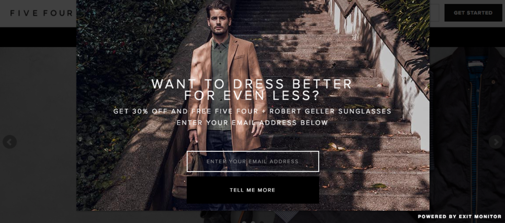
While there are several different strategies for Exit Pops (immediate sales, generate leads, reduce cart abandonment, cross-sell/upsell, and minimize bounce rate), my personal faves are the ones used to push people over the edge and reduce cart abandonment. These are typically last second discount offers, coupon codes, free shipping, or limited time opportunities. By testing Exit Pops for these different scenarios, you can see conversion rate lifts all the way up to 267%!

Here are some screenshots of some of my favorite Exit Popups.

13

Kill Your Entry Popup

As useful as the Exit Popup is, you’d think an entry popup is equally as helpful right? Wrong. The difficult part about determining the true performance of entry popups is that most of the research is very general or doesn’t test apples to apples. Think about this. When you first enter an online store to shop and they blast you with a full page popup, begging for an email address, you’re only going to give that email if you already planned on buying – which means shops are losing revenue. The other visitors just get annoyed at seeing a popup before they see what you’re offering. Save it for later. Your popup would have been better served during the checkout process, or as an exit incentive.

14

Dynamic Updating Shopping Carts

interactive-cart-and-checkout-bouncepilot

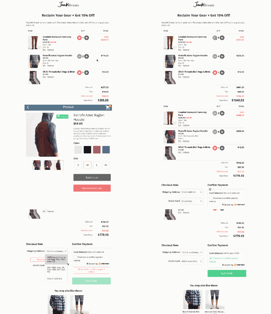
Shoppers demand faster and easier experiences. They want slick UI’s with fast load times. Even a 2-3 second delay updating or removing cart items can cost you millions. Amazon is a prime example (see what we did there?) of a business using a dynamic updating cart. Shopify and WordPress have existing plugins that can automatically update your cart or your developer can build it in Ruby on Rails or JQuery.

15

Shipping Costs

drake-example-shipping-cost-email

If you have to charge shipping, then be transparent. The last thing you want is to surprise shoppers at the last stage when purchasing your products. Roughly 36% of shoppers abandon the cart because the cost of shipping is too high. And too high typically means anything above free.

But 93% of shoppers say shipping costs are one of the most important factors in their online shopping experience,88% of shoppers prefer free shipping in 5-7 days rather than paying a fee for 1-3 day shipping, and 68% of shoppers have used a free shipping code. With the increase in shipping expectations and Amazon free prime delivery and the rise in free same day shipping from Amazon, I highly recommend reconsidering if the shipping cost is something you can eat.

16

Cross Sell/ UpSell At The Right Time

Fact: Cross-Selling and Upselling within the checkout experience can increase revenue by 7%. The trick is to do it as a recommendation engine. Some of my favorite examples are GoDaddy and Amazon. Both offer seamless experiences that make you WANT to buy more.

17

Create Purchase Urgency

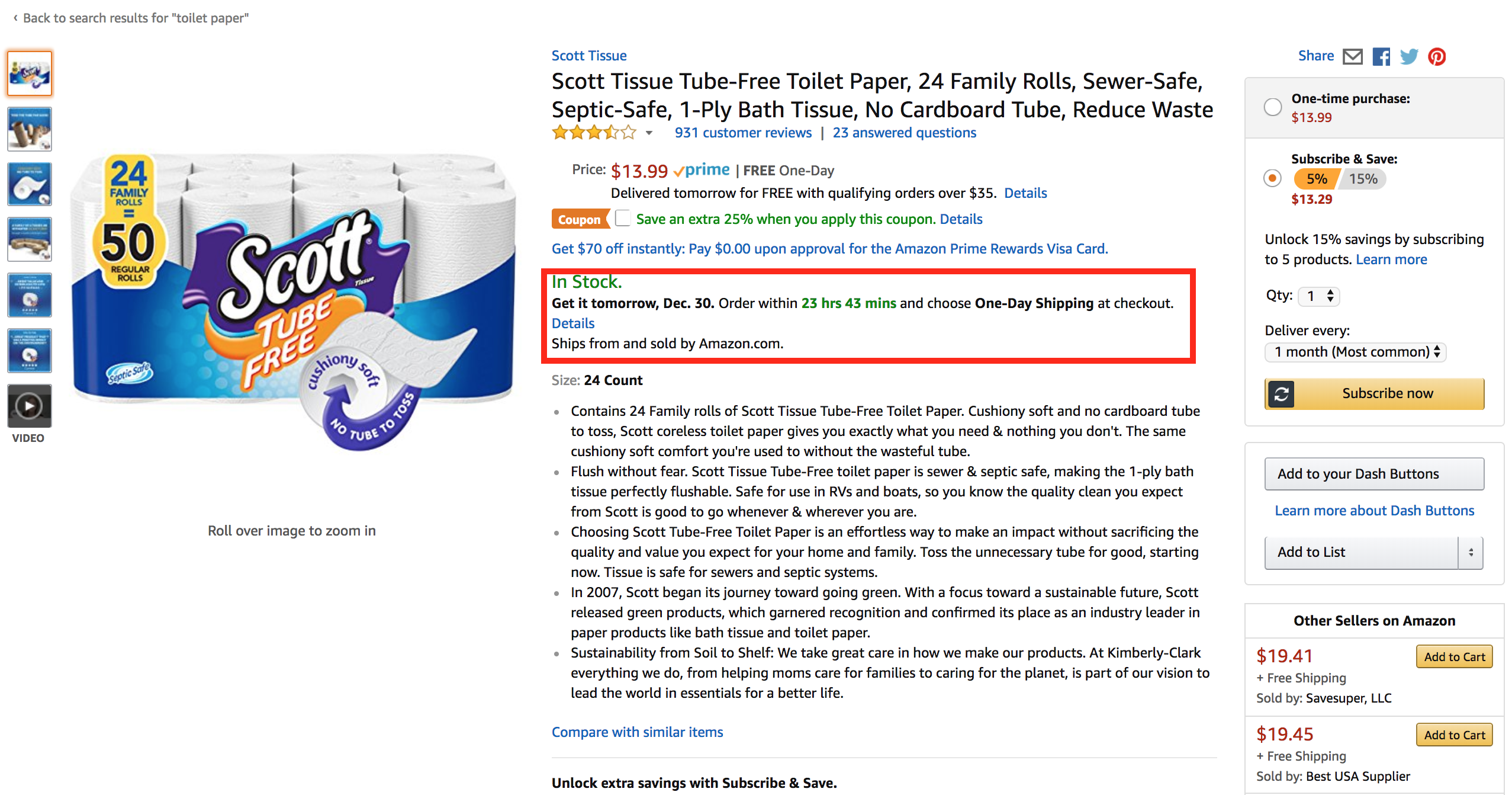
The use of urgency is nothing new. Think about those TV infomercials or limited time in-store sales. Now, what if you could have something like that running 24/7? Well, Amazon does. Amazon and other businesses like PetSmart have incorporated a shipping urgency model that creates a sense of urgency by informing you that if you purchase within “X” hours you will receive your products same day, next day, or within a specific time period. Another idea: show how many are left in stock when they get low.

amazon-transparent-messaging-bouncepilot

18

Transparent And Accurate Shipping Time

Think of this as 18B, – shipping is a factor in 93% of online purchases, so provide your customers with actual shipping times to increase purchase conversion rates and revenue.

West Elm is notorious for frustrating customers to the point of blogging. One of the main culprits is their shipping times.

This happened to our CEO – 3 months after moving to Boston and ordering an apartment-full of furniture from WestElm, he still hadn’t received a bedframe (which was supposed to arrive in 2 weeks). Get your distribution channel in order & make it transparent to customers, before purchase!

19

One Page Checkout

We get it. You want to collect information — and lots of it. But what form fields do you really need? Chances are a lot less than what you’re making your customers fill out. By reducing the number of fields and optimizing to a single page checkout, you can expect at least a 10-15% increase in conversion rates. Keep in mind this doesn’t include the reduction in the number of fields, or even trying to implement a single-click ordering system similar to Amazon. With these kinds of changes, you may even see increases by up 60%.

20

You Saved $X On Your Order

One of my favorite online sales events is West Elm’s “Buy More, Save More. “ What West Elm does is show the item sale price, and in the cart shows you how much you’ve saved. When purchasing several thousands dollars worth of items, that “saved” number is much more meaningful than the actual purchase price. After all, If I’m spending $5,000 on furniture but my cart emphasizes the $4,000 I’m saving by making that purchase, then it’s almost as if I’m saving money by spending money. Crazy right? If you find your store offering frequent sales events, then I highly suggest making sure the total saved amount get more emphasis in the cart during the checkout process.

21

Adding Testimonials/Reviews To Checkout Pages

Incorporating testimonials or reviews to your product or checkout pages is proven to increase conversion rates by 58%. This makes sense when you take into account that 88% of customers trust online reviews as much as personal recommendations. Depending on your product pages, here are a few ways to incorporate customer reviews during your checkout process.

Test-Ify!

Don’t forget that with any list conversion strategies, you should always remember the importance of testing.  Shoppers can be unpredictable and their reactions to different strategies may surprise you. Always implement every strategy through a testing methodology because you never truly know how it will perform unless you split test accordingly.

What are your favorite eCommerce conversion strategies?

Have you come across any retailers or shops doing such cool things that you couldn’t help but order from them? The most effective eCommerce strategies engage our curiosity and motivate us to try new things. No matter the product, conversion happens when we accept the possibilities offered by what we’re purchasing and are moved to investigate further.